


9 Webflow Migration Mistakes That Tank Rankings
The 9 most common Webflow migration mistakes we see: homepage redirects, lost metadata, leftover noindex tags and how to catch each one before it costs you traffic.
Actionable insights to improve SEO, speed, and conversions
Creating a seamless user experience is crucial for website success, and one of the most effective ways to enhance navigation is by implementing a sticky navbar in Webflow. A sticky navbar remains visible at the top of your website as users scroll, providing constant access to your main navigation elements without requiring visitors to scroll back to the top of the page.
Whether you're building a business website, portfolio, or e-commerce store, a well-implemented sticky navbar can significantly improve user engagement and conversion rates.
In this comprehensive guide, you'll learn exactly how to create a sticky navbar in Webflow using simple, no-code techniques that work perfectly across all devices and browsers.
A sticky navbar is a navigation element that remains fixed in place as users scroll through your website content. Unlike traditional static navigation that disappears when users scroll down, sticky navigation "sticks" to the viewport, typically at the top of the screen, ensuring constant access to your site's main navigation links.
The key difference between sticky and fixed positioning lies in their behavior: fixed positioning removes the element from the normal document flow and positions it relative to the viewport, while sticky positioning maintains the element's place in the document flow until it reaches a specified scroll position, then behaves like a fixed element.
This functionality dramatically improves user experience by eliminating the need for visitors to scroll back to the top of long pages to access navigation.
Sticky navbars work exceptionally well for content-heavy websites, including blogs, portfolios, e-commerce stores, and business websites with multiple service pages. They're particularly valuable for long-scrolling pages where users need quick access to different sections or pages without losing their current position.
However, consider your mobile users carefully, sticky navbars on mobile devices consume valuable screen. The best approach is to implement responsive sticky navigation that adapts appropriately to different screen sizes, potentially hiding on mobile or using a more compact design.
E-commerce websites benefit tremendously from sticky navbars, as they allow shoppers to access categories, search functions, and shopping carts without interrupting their browsing flow. Similarly, service-based businesses can keep contact information and key service links readily available, improving lead generation opportunities.
Before creating your sticky navbar, ensure you have an active Webflow account and a project with an existing navbar element. If you haven't created a navbar yet, add one using Webflow's navbar component from the elements panel.
For optimal results, we strongly recommend using a component-based navbar. This approach allows you to create the navbar once and reuse it across multiple pages. When you update the component on one page, it automatically updates across your entire site, saving time and ensuring consistency.
To convert your existing navbar to a component, select it and press Cmd/Ctrl + Shift + K, or use the right-click menu to "Create Component." This step is crucial for maintaining your sticky navbar across all pages efficiently.
Creating a sticky navbar in Webflow requires just three simple steps that take less than a minute to complete:
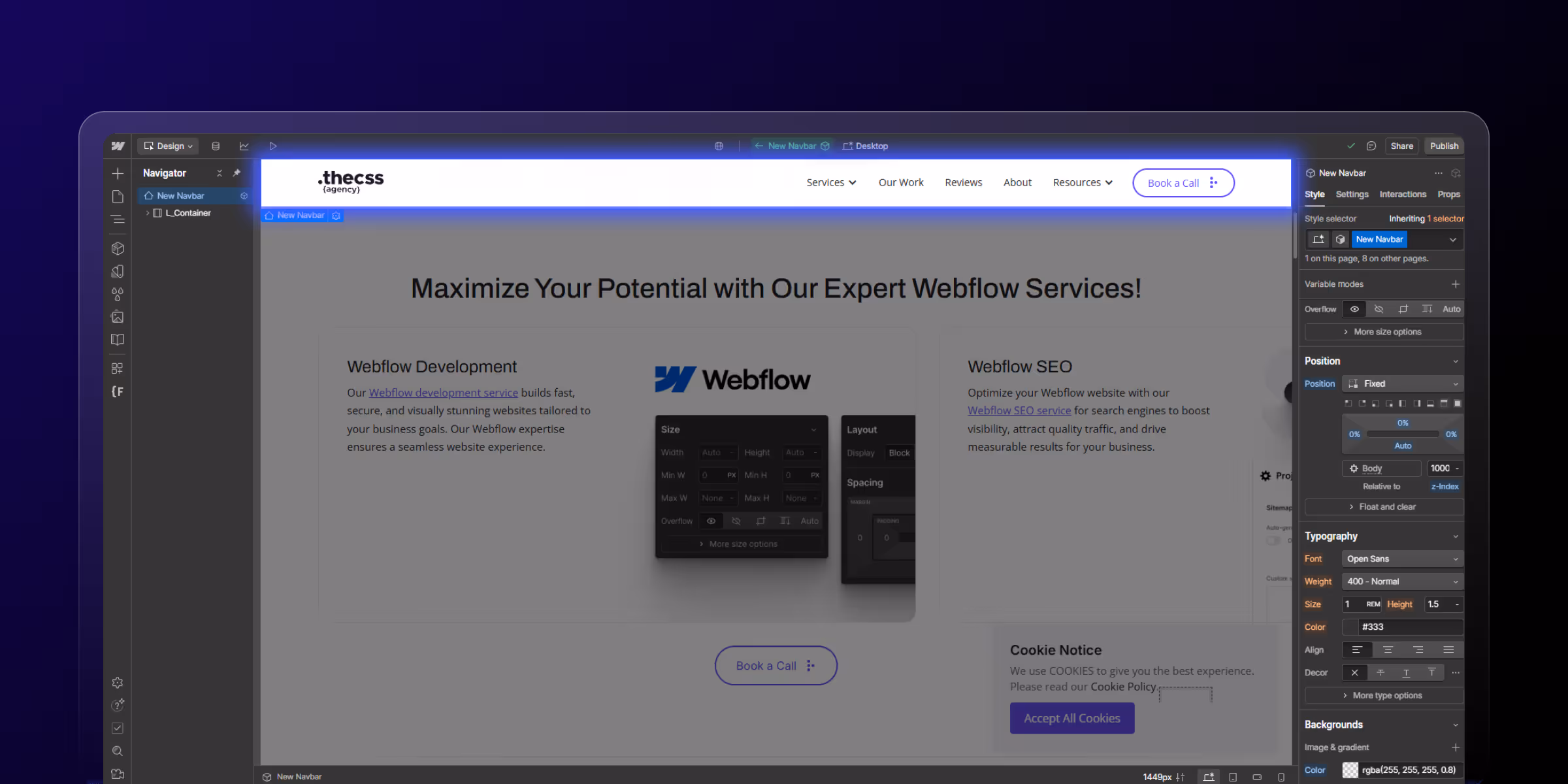
Click on your navbar component to select it. Ensure you're selecting the main navbar container, not individual elements within it. You'll see the navbar highlighted with a blue outline when properly selected.
With your navbar selected, navigate to the Style Panel on the right side of your screen. Find the Position section and click the dropdown menu. Select "Sticky" from the available options.
Immediately after setting the position to sticky, you'll need to define the top value. In the position section, locate the top field and set it to 0 pixels. This ensures your navbar sticks to the very top of the viewport when users scroll.
The final crucial step is setting an appropriate z-index value to ensure your sticky navbar appears above all other page content. Scroll down in the Style Panel to find the z-index field and set it to a high value like 999 or 9999.
This high z-index value ensures your navbar stays visible above images, videos, and other page elements that might otherwise cover it during scrolling.
After implementing these three steps, preview your website by clicking the preview button or pressing Cmd/Ctrl + P. Scroll down your page to verify that the navbar sticks to the top of the viewport and remains visible throughout the scrolling experience.
Test your sticky navbar across different devices and screen sizes using Webflow's responsive preview modes. Pay particular attention to mobile behavior, as sticky elements can impact the user experience on smaller screens differently than on desktop.
Once your basic sticky navbar is functional, you can enhance its appearance with various styling options. Consider adding a semi-transparent background or blur effect that activates when the navbar becomes sticky, creating a modern, professional appearance.
Background color adjustments can help your sticky navbar stand out against varying page content. Many designers use slightly darker backgrounds or add subtle shadows when the navbar is in its sticky state to create visual separation from the page content below.
Typography and spacing modifications ensure your navigation remains readable and appropriately sized when sticky. Sometimes adjusting padding, font weights, or link spacing improves the navbar's appearance and functionality in its fixed position.
Creating a sticky navbar in Webflow is remarkably simple, requiring just three steps: setting the position to sticky, defining a top value of 0, and configuring an appropriate z-index. This powerful feature dramatically improves user experience by keeping navigation accessible throughout the browsing session.
The implementation of sticky navigation can significantly impact your website's performance metrics, including user engagement, session duration, and conversion rates. By following this guide, you've equipped your Webflow site with professional-grade navigation that rivals custom-coded solutions.
Ready to take your Webflow website to the next level? theCSS Agency is leading Webflow Agency specializes in advanced Webflow customizations and can help you implement sophisticated navigation solutions, performance optimizations, and conversion-focused design elements. Contact us today to discuss how we can enhance your Webflow project with professional development expertise.


Sanket Vaghani has 8+ years of experience building designs and websites. He is passionate about building user centric designs and Webflow. He build amazing Webflow websites and designs for brands.
The 9 most common Webflow migration mistakes we see: homepage redirects, lost metadata, leftover noindex tags and how to catch each one before it costs you traffic.
Learn how to add schema to Webflow with this easy guide. Discover structured data and Webflow methods to boost your site's search visibility today.

Master Core Web Vitals for Webflow sites with our complete SEO guide. Improve LCP, INP, and CLS scores, boost rankings, and enhance user experience.
Quick Turnaround. No Contracts. Cancel Anytime. Book a 30 minutes consulting call with our expert.