


Webflow Interactions and Animations: Complete Guide (2026)
How Webflow Interactions work: trigger types (scroll, hover, click, page load), step-by-step setup, common use cases, GSAP integration, and troubleshooting when interactions don't fire.

Actionable insights to improve SEO, speed, and conversions
If you're new to business with a fresh website, people will tell you many things. Mobile site optimization will be first on the list.
Every platform handles mobile optimization differently. But you need to address it, no matter what you use.
If you use Webflow, this blog will help you master Webflow mobile optimization.
Mobile optimization means making your website work fast, easily, and smoothly on mobile devices so users have a great experience without zooming or struggling.
Mobile optimization makes your site work well on phones and tablets. It's not just about viewing; it's about function.
Good Webflow mobile-responsive design helps in many ways:
Start with mobile site optimization from day one. Design for phones first, then scale up to bigger screens.
This approach is called Webflow's mobile-first design. It works better than trying to shrink desktop layouts.
Webflow mobile responsive layouts adapt to any screen size. Use fluid grids and flexible layouts.
Webflow has built-in settings to adjust layouts for different devices. These tools make responsive design simple.
Page load speed matters on mobile. Slow pages cause visitors to leave fast.
Here's how to speed up Webflow website performance:
Design navigation that works on small screens. Options include hamburger menus or bottom navigation bars.
Make menu items big enough to tap easily. Keep menus short and simple. Make them easy to access from anywhere on your site.
Image compression is vital for Webflow performance optimization. Smaller files load faster on mobile devices.
Webflow gives you tools to compress images while keeping them sharp. Use them.
Set different image sizes for different screen widths. This ensures photos and videos look good everywhere.
Webflow lets you customize media for each breakpoint. Your visuals will always display correctly.
Mobile screens are small. Break up large text blocks into smaller chunks.
Use bullet points and numbered lists. Write in clear, simple language. Put your most important info at the top.
Use strong headings and clear calls to action. Guide users to what matters most.
Testing is a must for mobile optimization tips. Webflow provides tools to check your site on different devices.
Preview your design on various phones and tablets. Test on different browsers too. Fix any issues before going live.
Common issues include slow load times and tricky navigation. Webflow's tools help you find and fix these problems quickly.
Regular testing helps you catch issues early. Don't skip this step.
Touch interactions matter on mobile. Make buttons and links big enough to tap easily.
Use gesture-based navigation where it makes sense. Make sure interactive elements respond quickly to touch.
Test on real devices to verify that all touch actions feel natural and work smoothly.
Here are the essential mobile optimization techniques:
Mobile usage keeps growing. Staying current with Webflow mobile optimization is critical.
Focus on these trends:
Working with a Webflow agency can help you stay ahead. Expert guidance makes a big difference.
Webflow mobile optimization, crucial for user experience, involves responsive design, image optimization, and more. Implementing these tools will not only attract mobile traffic but also enhance conversion rates. As mobile usage rises, staying ahead with techniques like faster page load speeds and advanced responsive design is essential for the future. Partnering with a skilled Webflow agency can provide expert guidance in navigating these trends.
Mobile optimization creates a smooth user experience. It brings more traffic and boosts conversion rates on phones and tablets.
Focus on responsive design, image optimization, and faster page load speeds. These three areas have the biggest impact.
Use responsive design, compress images, and prioritize speed. Test regularly on real devices and fix any issues you find.
No. While user experience matters most, mobile optimization also attracts more traffic and increases conversions.
Expect faster load times, better responsive design tools, and new ways to improve mobile experiences.
Agencies provide expert help and keep you current with the latest techniques. They ensure your site performs at its best.
Yes. Webflow includes debugging tools, speed optimization features, and responsive design settings. These will help you solve common mobile problems.


Viken Patel has 17+ years of experience working with websites. He is passionate about building website that converts. His marketing background helps him build the sales driven websites.
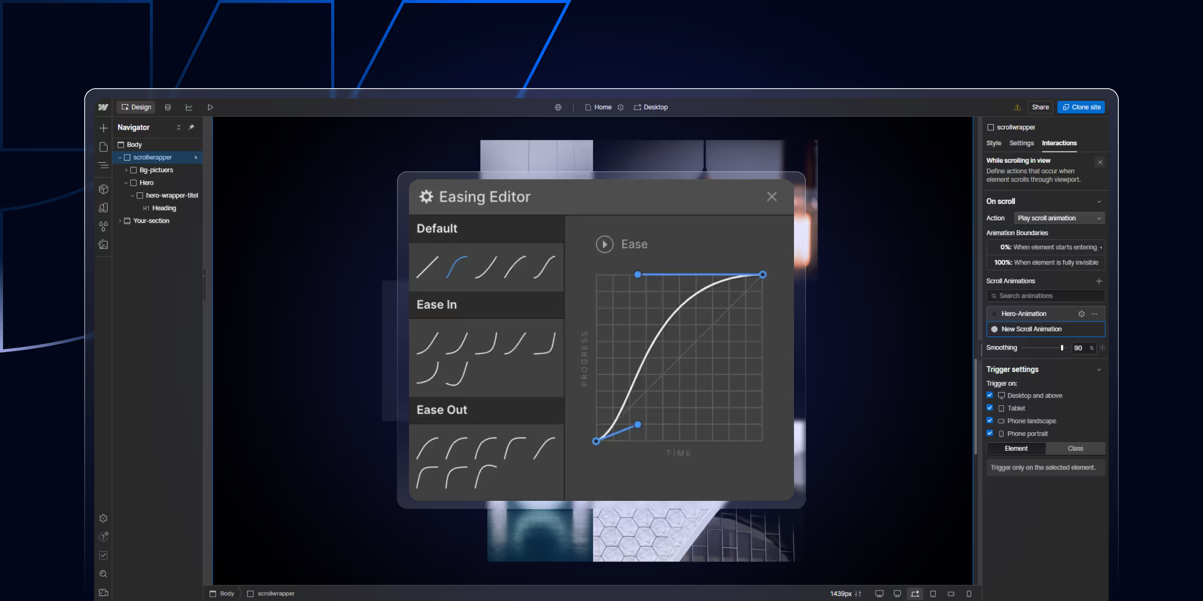
How Webflow Interactions work: trigger types (scroll, hover, click, page load), step-by-step setup, common use cases, GSAP integration, and troubleshooting when interactions don't fire.

Learn how to build a high-impact B2B SaaS SEO strategy that attracts qualified leads, boosts rankings, and drives consistent revenue. Step-by-step framework with real growth tactics
A Webflow Premium Partner is an agency at the top tier of Webflow's official partner program.
Quick Turnaround. No Contracts. Cancel Anytime. Book a 30 minutes consulting call with our expert.