


AI in Modern Web Design: Tools, Benefits & Future Trends (2026)
Read how AI is changing modern web design in 2026. From AI design tools to personalization and automation, learn how designers and agencies are building smarter websites.

Actionable insights to improve SEO, speed, and conversions
Webflow has no native border-gradient control, so you create one with custom CSS. The reliable method is the `border-image` property applied through an embed or custom code block: set `border: 4px solid transparent;` then `border-image: linear-gradient(45deg, #color1, #color2) 1;`. A no-code workaround is nesting a smaller solid-background div inside a gradient-background div.
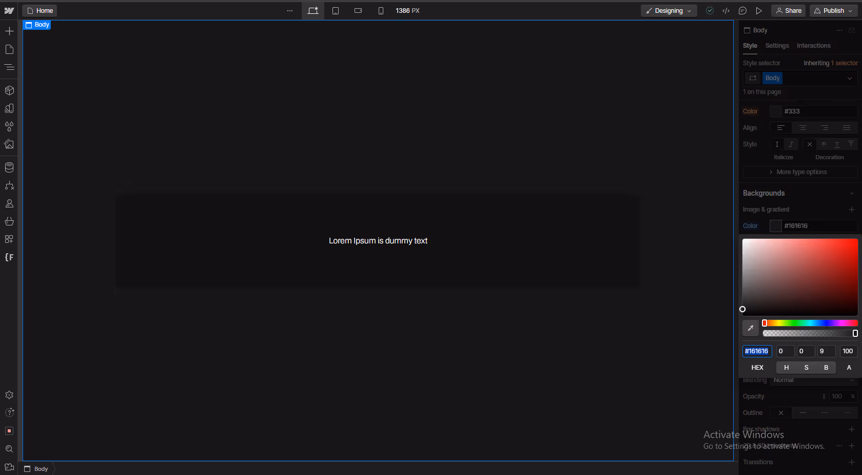
Webflow's built-in border styling supports solid colors only no gradients. To add a gradient border in Webflow, you need a small amount of custom CSS. This guide covers two methods (border-image and parent-wrapper), how to make the gradient animated, how to apply it on hover, and how to handle the most common cross-browser issues. All code is copy-paste ready.
Step-by-step border gradient Webflow guide is coming right up! We'll walk you through creating a parent block for your element and defining a stunning border gradient style. Play with the colors and direction to create a subtle border gradient effect or a more dramatic statement piece. With Webflow, you can forget about CSS stroke gradients and CSS border-color gradients—it's all visual and intuitive!
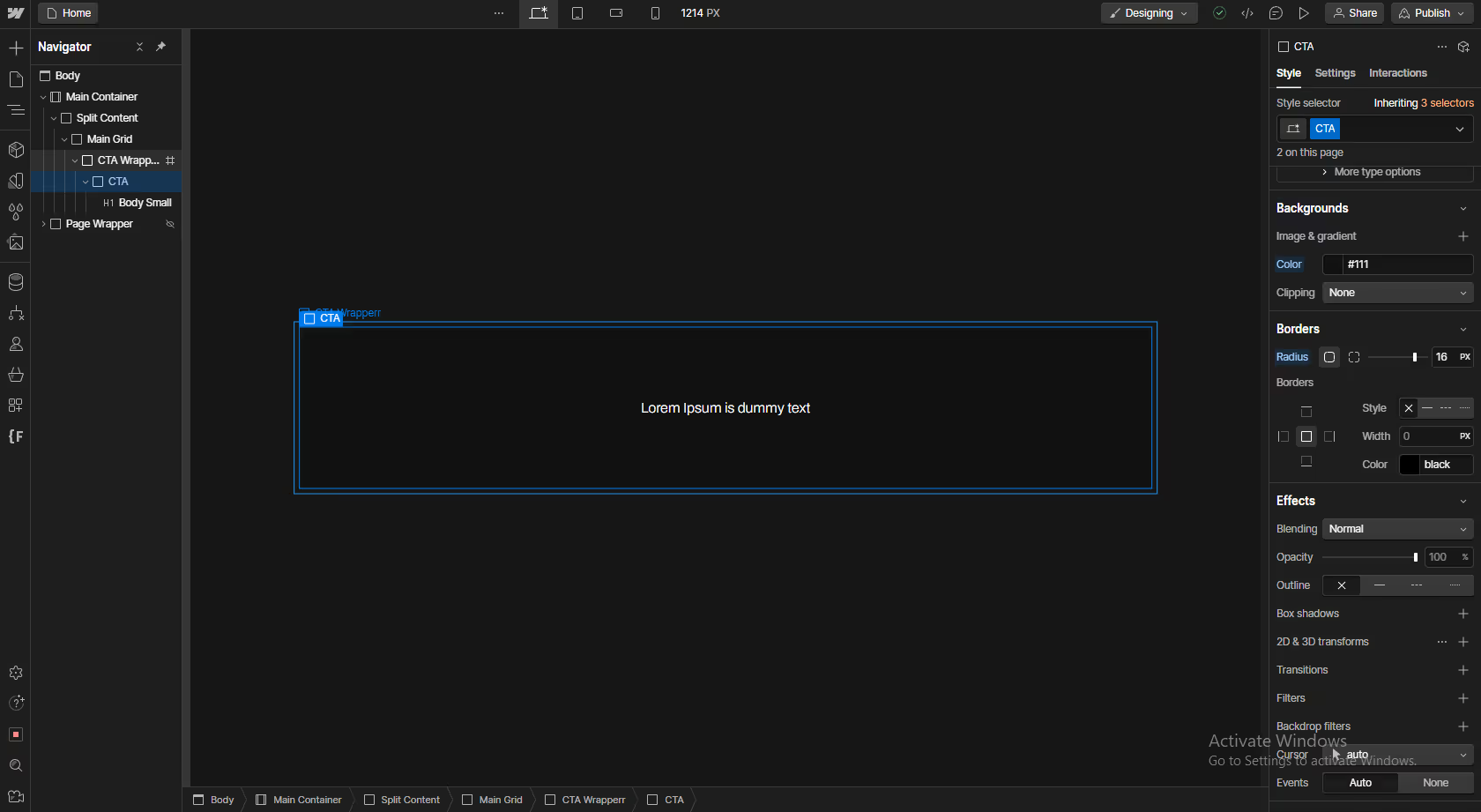
In your Webflow design, add the element you want to apply the border gradient to. This could be a button, a div block, or any other element.
Instead of directly adding a border to the element, you'll create a gradient on the element's parent block, a common technique for achieving a gradient stroke border in Webflow.
In the Webflow gradient text editor, you'll define the colors and direction of the gradient.
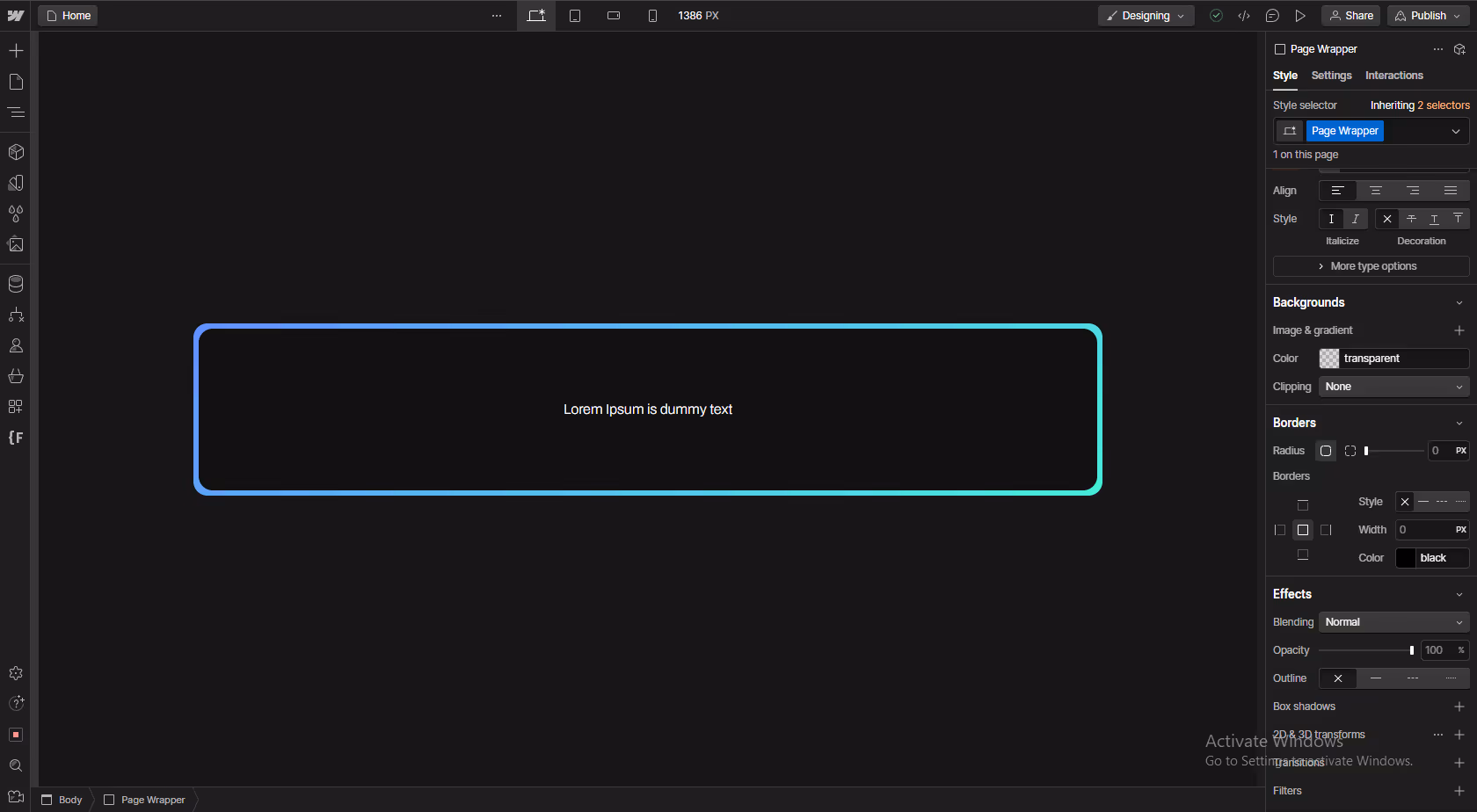
To make the button itself appear seamless with the background and create a stronger border illusion, you can use a border color linear gradient and set the button's fill color to match the page background color.
By following these steps, you can create stylish and eye-catching Webflow gradient borders that enhance your website's design.
Also, Know: 5 Best Sliders to Enhance Your Webflow Website
The CSS border-image property applies a gradient directly to the border without a wrapper element. This is the most concise CSS approach, but has one critical limitation: border-image ignores border-radius. Use this method for rectangular elements only.
Add this CSS to your Webflow site's Custom Code (Site Settings → Custom Code → Before </head>):
/* Add a class to the element in Webflow Designer, e.g. "gradient-border-img" */
.gradient-border-img {
  border: 3px solid transparent;
  border-image: linear-gradient(135deg, #ff6b6b, #4ecdc4) 1;
}
Then assign the class gradient-border-img to your element in Webflow's Style panel. Change the colors (#ff6b6b, #4ecdc4) and the gradient angle (135deg) to match your design.
Limitation: Setting a border-radius on an element with border-image will not produce rounded corners the border-image overrides the radius. For rounded gradient borders, use Method 3 (pseudo-element) instead.
The pseudo-element method uses a ::before element positioned behind the main element to simulate a gradient border. This is the most flexible approach: it supports rounded corners, animated gradients, and hover transitions. The trade-off is that it requires adding CSS to your site and the element must have position: relative set.
Add this CSS to Site Settings → Custom Code → Before </head>:
/* Assign class "gradient-border-pseudo" to your element in Webflow */
.gradient-border-pseudo {
  position: relative;
  background: #ffffff; /* must match element's background color */
  border-radius: 8px;
  z-index: 0;
}

.gradient-border-pseudo::before {
  content: '';
  position: absolute;
  inset: -2px; /* controls border thickness: increase for a thicker border */
  border-radius: 10px; /* must be 2px larger than parent to align */
  background: linear-gradient(135deg, #ff6b6b, #4ecdc4);
  z-index: -1;
}
Assign the class gradient-border-pseudo to your element in Webflow's Style panel. Set the element's background color to match its container background this creates the border illusion. Adjust inset for border thickness (e.g., inset: -3px for a 3px border) and update both border-radius values proportionally.
To animate the gradient so it shifts colors continuously, replace the ::before background with a larger gradient and add a keyframe animation:
.gradient-border-animated {
  position: relative;
  background: #ffffff;
  border-radius: 8px;
  z-index: 0;
}

.gradient-border-animated::before {
  content: '';
  position: absolute;
  inset: -2px;
  border-radius: 10px;
  background: linear-gradient(45deg, #ff6b6b, #4ecdc4, #a855f7, #ff6b6b);
  background-size: 300% 300%;
  animation: gradientRotate 3s ease infinite;
  z-index: -1;
}

@keyframes gradientRotate {
  0%   { background-position: 0% 50%; }
  50%  { background-position: 100% 50%; }
  100% { background-position: 0% 50%; }
}
The background-size: 300% 300% makes the gradient larger than the element so the animation has room to shift. Adjust the 3s duration for faster or slower cycling.
To show the gradient border only on hover (useful for cards and buttons), start with a solid border and transition to the gradient on :hover:
.gradient-border-hover {
  position: relative;
  background: #ffffff;
  border-radius: 8px;
  border: 2px solid #e5e7eb; /* default solid border */
  transition: border-color 0.3s ease;
  z-index: 0;
}

.gradient-border-hover::before {
  content: '';
  position: absolute;
  inset: -2px;
  border-radius: 10px;
  background: linear-gradient(135deg, #ff6b6b, #4ecdc4);
  z-index: -1;
  opacity: 0;
  transition: opacity 0.3s ease;
}

.gradient-border-hover:hover::before {
  opacity: 1;
}

.gradient-border-hover:hover {
  border-color: transparent;
}
On hover, the solid border becomes transparent while the gradient pseudo-element fades in creating a smooth transition from solid to gradient border.
Form inputs are a common use case for gradient borders (highlighting a focused input field is a popular UI pattern). The border-image method doesn't work on inputs in all browsers, so the pseudo-element method is more reliable. However, pseudo-elements on native <input> elements don't render consistently in all browsers either.
The most reliable approach for form inputs: use the parent-wrapper method (Method 1) on the Form Block or a wrapping div, then add a matching background color on the input to create the gradient border illusion. For a focus state, add custom CSS targeting the input's :focus state to change the parent wrapper's gradient:
/* Wraps the input in Webflow — assign class "form-gradient-wrapper" to wrapper div */
.form-gradient-wrapper {
  background: linear-gradient(135deg, #e5e7eb, #e5e7eb); /* neutral default */
  padding: 2px;
  border-radius: 6px;
  transition: background 0.3s ease;
}

/* When the input inside is focused, change the wrapper gradient */
.form-gradient-wrapper:focus-within {
  background: linear-gradient(135deg, #ff6b6b, #4ecdc4);
}

.form-gradient-wrapper input {
  background: #ffffff;
  border: none;
  border-radius: 4px;
  width: 100%;
  padding: 10px 14px;
}
The :focus-within pseudo-class applies when any child element (the input) is focused no JavaScript needed. The input's border is removed and the wrapper's gradient provides the border effect.
Create stunning Webflow border gradients in just a few steps! This guide unlocks the power of border gradients in Webflow.
Forget CSS gradient borders and linear gradient borders—Webflow's visual interface makes it easy.
We'll show you how to create a parent block for your element and define a beautiful border gradient style. Play with colors and direction for a subtle border gradient effect or a bold statement piece.
Want to make the border seamless? Match the element's fill to your background for a complete illusion. Gradients are a powerful tool to boost your website's visual appeal, subtly guide user attention, and showcase your brand identity.
Also, Read: Webflow For Non-Designers: Drag & Drop Website Builder For Beginners
It depends on the method. The no-code parent-wrapper method (Method 1) requires a parent div wrapped around your element the gradient is set on the wrapper, not the element itself. The CSS pseudo-element method (Method 3) applies directly to the target element via a ::before pseudo-element, requiring no wrapper. The border-image method (Method 2) also applies directly to the element. Choose the method based on your needs: no-code, border-radius support, or animation.
Webflow provides an angle picker and directional arrows within the gradient editor. A common choice for a subtle border effect is a linear gradient set to 0 degrees, which creates a transition from top to bottom.
Beyond the steps mentioned, you can explore further customization:
The parent block's background color will become the starting point of your gradient. Make sure it complements the colors you choose for the border gradient itself.
Unfortunately, directly applying a border gradient to text elements isn't possible in Webflow. However, you can achieve a similar effect by using a text block inside a parent block with a border gradient.


Sanket Vaghani has 8+ years of experience building designs and websites. He is passionate about building user centric designs and Webflow. He build amazing Webflow websites and designs for brands.
.avif)
Read how AI is changing modern web design in 2026. From AI design tools to personalization and automation, learn how designers and agencies are building smarter websites.

Connect your Webflow forms to Mailchimp three ways: natively, via Zapier, and embed with step-by-step setup, field mapping, and fixes for subscribers not syncing.
Figma designs, Webflow publishes, but Figma Sites blurs the line. Here's Webflow vs Figma and Figma Sites compared, plus how the Figma-to-Webflow workflow fits.
Quick Turnaround. No Contracts. Cancel Anytime. Book a 30 minutes consulting call with our expert.