


Webflow Premium Partner: What It Means and Why It Matters
A Webflow Premium Partner is an agency at the top tier of Webflow's official partner program.
Actionable insights to improve SEO, speed, and conversions
Flexbox is best for one-dimensional layouts (single rows or columns) and component-level alignment. CSS Grid is best for two-dimensional layouts (rows AND columns) and full page structures. Most modern websites use both Grid for the macro layout, Flexbox for the components inside it. They're complementary, not competing.
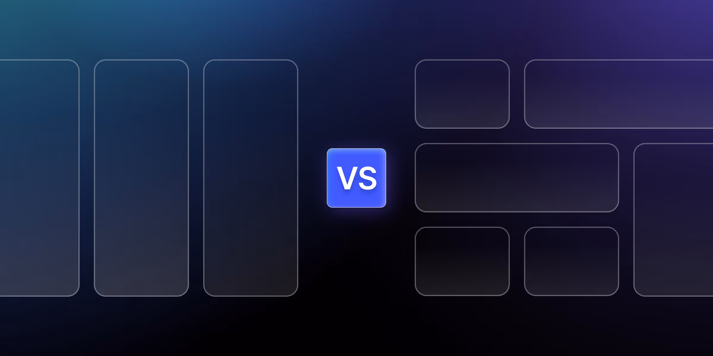
Flexbox and CSS Grid are the two modern CSS layout systems. They solve different problems: Flexbox handles content flow in a single direction (row or column), while Grid handles two-dimensional layouts with explicit rows and columns. Choosing between them isn't about which is better it's about which fits the specific layout problem. This guide covers when to use each, with real-world examples and code.
Development efficiency improves dramatically when you choose the appropriate layout system from the start. Projects using optimal layout combinations are completed 30-50% faster than those requiring extensive refactoring due to incorrect initial choices.
User experience directly correlates with layout implementation quality. Proper Flexbox usage creates smooth content flow and natural alignment, while strategic Grid implementation enables complex, visually appealing designs that maintain consistency across breakpoints.
Performance implications vary between layout systems. Grid can require more computational resources for complex layouts, while Flexbox typically renders faster for simple component alignment. Understanding these trade-offs enables informed decisions that balance functionality with performance.
Long-term maintenance becomes significantly easier when layouts match their intended purpose. Flexbox layouts remain flexible and content-adaptive, while grid layouts provide predictable structure that scales systematically as projects evolve.
The designer interface provides intuitive controls for both Flexbox and Grid implementation. Visual indicators, alignment guides, and responsive previews eliminate guesswork while maintaining full control over CSS properties.
Responsive breakpoint management enables different layout strategies across device sizes. You can use Grid for desktop complexity while switching to Flexbox for mobile simplicity, all within Webflow's visual interface.
Visual debugging capabilities include element highlighting, spacing visualization, and alignment guides that reveal exactly how layouts behave. This instant feedback accelerates learning and reduces development iterations.
Modern CSS standards integration ensures Webflow's visual tools generate clean, efficient CSS that matches hand-coded implementations while providing visual convenience for designers.
Flexbox is a one-dimensional layout concept, which means Flexbox controls only rows OR columns at a time. This limitation becomes a strength when you need flexible, content-adaptive layouts that respond naturally to varying content sizes.
A content-first approach allows flex items to size themselves based on their content and then distributes remaining space according to your specifications. This dynamic behavior makes Flexbox perfect for navigation menus, button groups, and content cards that need to adapt to varying text lengths.
Use Flexbox when your layout is one-dimensional — a single row or single column where items align along one axis. Common cases: navigation bars, card rows where content sizes can vary, button groups, vertical centering, distributing space between siblings, and component-level micro-layouts (icon + text combinations, form rows).
Setting up flex containers begins by selecting any element (div, section, container) and changing its display property to "Flex" in Webflow's Style panel. This immediately transforms child elements into flex items that respond to flex container rules.
Configuring flex direction determines whether items are arranged horizontally (row) or vertically (column). Webflow provides visual controls for direction, with additional options for reverse ordering when needed.
Alignment and justification options control item positioning along both axes:
Gap properties in modern Webflow provide spacing between flex items without requiring margins on individual elements. This feature simplifies responsive design and maintains consistent spacing across breakpoints.
Flex item properties allow individual items to override container rules:
Flex wrap enables responsive behavior by allowing items to move to new lines when horizontal space becomes limited. Combined with gap properties, this creates naturally responsive layouts without media queries.
Order property changes visual order without affecting HTML structure, enabling complex responsive layouts where element order changes across breakpoints. This accessibility-friendly approach maintains semantic HTML while providing visual flexibility.
Nested flexbox layouts solve complex alignment challenges by combining multiple flex containers. For example, a horizontal flex container for overall layout with vertical flex containers for individual card components.
Common flexbox patterns include:
Two-dimensional layout capabilities mean Grid controls rows AND columns simultaneously, enabling complex layouts that were previously impossible or required complex positioning hacks.
The layout-first design approach means you define the grid structure first, then place content into predetermined areas. This methodology works excellently for consistent, structured designs like dashboards, magazines, or portfolios.
Grid terminology includes essential concepts:
Explicit vs implicit grid behavior affects how content flows when you have more items than defined grid cells. Webflow automatically creates additional rows (implicit grid) using default sizing, which you can control through grid settings.
Use CSS Grid when your layout is two-dimensional — when you need to control both rows AND columns simultaneously. Common cases: full page layouts, dashboard structures, magazine-style designs, image galleries with mixed sizes, and any layout where elements need to align across both axes.
Creating grid containers starts by selecting an element and changing its display property to "Grid" in Webflow's Style panel. The visual grid overlay immediately shows your grid structure and guides content placement.
Column and row configuration uses intuitive visual controls in Webflow:
Grid gap management provides consistent spacing between grid items without affecting the grid structure itself. Webflow allows separate control of row gaps and column gaps, or synchronized gap settings.
Item placement techniques include:
Navigation and menu layouts benefit from Flexbox's content-adaptive behavior. Menu items can grow or shrink based on text length while maintaining equal spacing and alignment.
Button groups and form elements work excellently with Flexbox because buttons need consistent spacing and alignment regardless of text content length. Flexbox automatically handles these size variations.
Card layouts and content alignment use Flexbox's ability to create equal-height cards and center content within them. This creates professional-looking content grids without complex positioning.
Simple responsive components benefit from Flexbox's natural wrapping behavior. Items automatically move to new lines when horizontal space becomes limited, creating responsive layouts without media queries.
Dynamic content scenarios where content length varies significantly work better with Flexbox because it adapts naturally to content size changes rather than forcing content into predetermined grid cells.
Complex page layouts and templates require Grid's two-dimensional control for precise positioning of headers, sidebars, main content, and footers. Grid handles these macro layouts more efficiently than complex Flexbox nesting.
Image galleries and portfolio grids benefit from Grid's ability to create consistent, structured layouts with precise control over item sizing and positioning. Mixed content sizes work well with Grid's flexible sizing options.
Dashboards and data presentations require Grid's systematic approach to organizing multiple content areas with consistent spacing and alignment. Grid's template areas make complex dashboards maintainable.
Magazine-style content layouts with complex text wrapping, image placement, and varied content blocks work best with Grid's precise positioning capabilities.
Structured design systems require Grid's consistent, predictable layout behavior for maintaining design standards across multiple pages and components.
Macro layout with Grid and micro layout with Flexbox represent the optimal approach for most complex projects. Grid handles overall page structure, while Flexbox manages component-level alignment and spacing.
Nested layout strategies use Grid for page templates and section layouts, then Flexbox within grid areas for content alignment, navigation, forms, and other component-level layouts.
Responsive design considerations might use Grid for desktop complexity but switch to Flexbox for mobile simplicity. Webflow's breakpoint system enables this hybrid approach seamlessly.
Performance optimization balances Grid's structural advantages with Flexbox's rendering efficiency, using each system where it provides the most benefit with the least computational overhead.
Header navigation with logo and menu demonstrates classic Flexbox usage:
Card component with flexible content showcases content-adaptive behavior:
Button group with equal spacing illustrates distribution control:
Sidebar layout with dynamic content shows flexible space distribution:
Product catalog with responsive columns demonstrates Grid's structured approach:
Blog post layout with sidebar showcases Grid's template capabilities:
Dashboard with widget areas illustrates complex positioning:
Portfolio gallery with mixed sizes demonstrates Grid's flexibility:
Misunderstanding Flex-basis and sizing cause unexpected layout behavior. Flex-basis sets the starting size before growing or shrinking, not the final size. Always consider flex-grow and flex-shrink when setting flex-basis values.
Incorrect use of flex-wrap leads to overflow issues or unwanted wrapping. Test wrap behavior across breakpoints and adjust item sizes or container widths to achieve desired responsive behavior.
Alignment confusion occurs when developers mix up main axis and cross axis properties. Remember that flex-direction determines which axis is main, affecting how justify-content and align-items behave.
Performance issues with complex nesting arise when using multiple nested flex containers unnecessarily. Consider if Grid might handle the macro layout more efficiently while reserving Flexbox for component-level alignment.
Overcomplicating simple layouts happens when developers use Grid for layouts that Flexbox would handle more simply. Single-row or single-column layouts usually work better with Flexbox.
Implicit grid overflow issues occur when content exceeds defined grid areas. Plan for content growth and set appropriate implicit grid sizing to handle overflow gracefully.
Browser compatibility problems can arise with advanced Grid features. Test across target browsers and provide fallbacks for older browsers if necessary.
Maintenance and scalability problems develop when grid layouts become overly complex. Keep grid templates simple and use nested layouts rather than extremely complex single grids.
Rendering speed differences show that Flexbox typically renders faster for simple layouts due to less computational complexity. Grid requires more calculation for two-dimensional positioning but handles complex layouts more efficiently than nested Flexbox alternatives.
Memory usage varies based on layout complexity. Simple Flexbox layouts use less memory, while complex Grid layouts may be more efficient than equivalent nested Flexbox structures.
Mobile performance considerations favor Flexbox for content-heavy layouts that need to adapt to varying content sizes. Grid works well for structured layouts that remain consistent across devices.
Core Web Vitals impact depends on implementation efficiency. Well-implemented grid layouts can improve Cumulative Layout Shift (CLS) by providing a stable layout structure.
Avoiding unnecessary nesting improves both performance and maintainability. Use Grid for macro layouts and Flexbox for micro layouts rather than deeply nested structures.
Efficient grid definitions use appropriate sizing methods (fr units, minmax, auto) to minimize recalculation when content changes. Avoid overly complex grid templates that require frequent recomputation.
Responsive design optimization chooses appropriate layout methods for each breakpoint. Complex desktop grids might simplify to Flexbox stacks on mobile for better performance and usability.
Testing strategies include performance monitoring across different devices and content scenarios to identify potential bottlenecks before they impact users.
Container queries will enable layout decisions based on container size rather than viewport size, making component-based layouts more flexible and reusable.
Subgrid support allows nested grids to align with parent grid lines, enabling more sophisticated layout possibilities while maintaining alignment consistency.
CSS cascade layers provide better control over layout styles in complex projects, especially when combining custom CSS with Webflow's generated styles.
Upcoming top Webflow features continue expanding visual control over advanced CSS properties, making complex layouts more accessible to visual designers.
Mastering Flexbox and Grid transforms Webflow development from struggle to systematic success. Flexbox excels at one-dimensional content flow and component alignment, while Grid dominates complex two-dimensional layouts and page architecture.
The decision framework is clear: Use Flexbox for content-adaptive components and simple alignment needs. Choose Grid for structured layouts and complex positioning requirements. Combine both systems strategically for optimal results.
Implementation success comes from understanding each system's strengths and limitations rather than forcing one system to handle inappropriate use cases. This knowledge prevents common mistakes while enabling efficient, maintainable layouts.
Professional development requires continuous practice with both systems across different project types and complexity levels. The investment in layout mastery pays dividends throughout your entire development career.
Ready to master advanced Webflow layouts that combine Flexbox and Grid for maximum efficiency and maintainability? theCSS Agency specializes in complex layout implementations that balance visual design requirements with technical performance. Our systematic approach ensures your layouts work beautifully while remaining scalable and efficient.
Schedule your layout consultation today and discover how professional layout expertise can transform your Webflow development process and project outcomes.
Flexbox is best for arranging elements in a single direction, either horizontally or vertically, while Grid provides full two-dimensional control, allowing you to align elements both in rows and columns.
Use Flexbox when you need simple, one-dimensional layouts such as navigation bars, buttons, or content cards. It’s perfect for aligning and distributing space among items in a single line or column.
Use Grid when building complex, two-dimensional layouts like galleries, product sections, or landing page structures. It gives you precise control over spacing, alignment, and responsive design.
Yes, absolutely. Many designers use Flexbox inside Grid layouts (and vice versa) to get both flexibility and structure. This hybrid approach helps achieve pixel-perfect responsive designs.
Yes — and you should. Most modern websites combine them. Use Grid for the macro page structure (header, sidebar, main content, footer), then Flexbox inside individual grid cells for component layouts. They work together cleanly because they solve different layout problems.
Both have nearly identical performance in modern browsers. Performance differences are negligible — choose based on layout fit, not speed. Both are GPU-accelerated and equally efficient.
Start with Flexbox. It's simpler, used in nearly every project, and easier to grasp because it's one-dimensional. Once you're comfortable with Flexbox, CSS Grid will feel like a logical extension for two-dimensional cases.


Sanket Vaghani has 8+ years of experience building designs and websites. He is passionate about building user centric designs and Webflow. He build amazing Webflow websites and designs for brands.

A Webflow Premium Partner is an agency at the top tier of Webflow's official partner program.

Learn how to build a high-impact B2B SaaS SEO strategy that attracts qualified leads, boosts rankings, and drives consistent revenue. Step-by-step framework with real growth tactics

Programmatic SEO on Webflow means generating many landing pages from one CMS Collection template one page per.
Quick Turnaround. No Contracts. Cancel Anytime. Book a 30 minutes consulting call with our expert.